Gather Your Ideas, Craft Your Slides and Deliver Your Talk
Recently, I had the opportunity to speak at the Podcast Movement conference. It was easily one of the best conferences I’ve ever attended. Hard to believe it’s only in its second year.
It was an honor to share the stage with some pretty big names! And though I’d like to believe I bring my “A” game every time, finding myself in this group would require me to pull out all the stops.
Thankfully, my speaking opportunities have increased considerably in the two years since launching this podcast, giving me the chance to hone my skills on smaller stages.
Subscribe: iTunes | Stitcher | RSS
In today’s episode, I cover:
- How I gather and organize my presentation content
- Leveraging Canva to create your slides and wow your audience
- The importance of placing emphasis on images over text
- And a lot more!
This Episode is Sponsored By SoFi
Read to Lead is supported by SoFi, a leading marketplace lender.
You could save thousands when you refinance your federal and private students loans at lower rates with SoFi.
Take advantage of a special $200 welcome bonus for Read to Lead listeners who refinance their student loans.
Go to SoFi.com/readtolead and find your rate online. Accelerate your success with a smarter loan.
Over the last four to five years, I’ve read my share of presentation-related books and blog posts to further refine my approach, not to mention the experts whose advice you and I have benefitted from here on the show (some of whom have written books on the topic, and many others whom I’ve asked to share their best presentation tips).
Content is Key, But…
Content is key, of course, but where I find many people get stuck is when they attempt to translate that content to slides. It can be a tedious process for some, but it happens to be one I thoroughly enjoy. I’d like to believe my passion has helped me get pretty good at it.
Since delivering my Podcast Movement presentation, I’ve received a number of questions about how I attack the process. If you’d like to improve your presentation preparation process and have attendees buzzing about your talk afterwards, I encourage you to employ these simple but effective tips and techniques.
Start With An Outline
A key first step in preparing any talk is developing an outline. Surprising as it might sound, I find most people never bother to do this. I am guilty in the past of only developing my main points before moving on to creating my slides. I strongly recommend, however, that you fully flesh out your entire talk, including your supporting points, before you even entertain the idea of slides. The benefits are numerous.
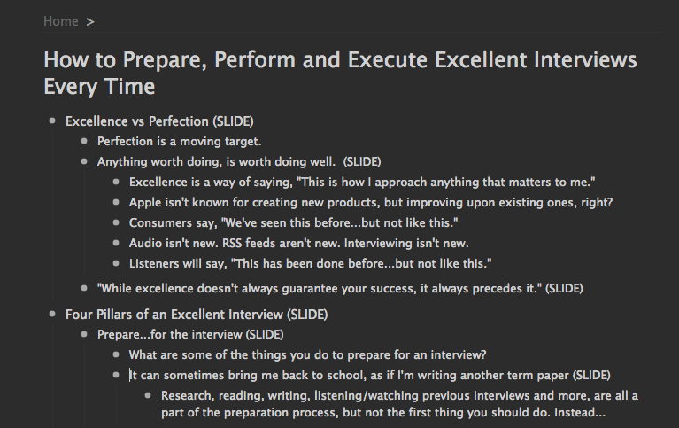
First, an outline helps give you a birds-eye view of your talk throughout the entire process. I’ve found an outline to be by far the best way to lay out my talk than any other method I’ve tried (Post-It Notes anyone?).
To do this, I use the web and mobile app Workflowy. Workflowy is simple to use and syncs across all your devices. There is both a free version and a paid version.
When an idea strikes, or I come across something I think I might want to include or touch on in my talk, I add it to my Workflowy outline. In the beginning, I’m just adding the ideas, making it more of a list than an outline.
However, as I start to see connections between topics and ideas, I begin organizing them into an order or flow that makes sense. Workflowy makes it easy to move items around if the need to adjust your hierarchies arises (it will).
Additional Options: Evernote is another perfectly viable option for this. I appreciate though that Workflowy does one thing very well. I’ve also tried using the presentation web app Prezi for this process. Prezi acts like a whiteboard for developing your ideas, allows you to begin connecting those ideas as they form, and then use it to deliver your presentation, zooming into and out of each of your points along the way. I’ve found value though in using a separate app or software for each phase of the process. If you prefer doing everything under one roof, Prezi may be worth looking into.
As a flow for my talk begins to reveal itself, I begin noting where I may want to include abstract images (SLIDES in the image above) to drive home a particular point or idea.
Then, once my outline is complete and I’ve noted all the places where I’d like to include a slide, I move to the second step in the process. The slides themselves.
Images First, Text Second
I’ve tried just about every presentation software, app and image resource there is. Keynote is my favorite for delivering my presentations – I connect my iPad to the projector I’ll be using and use my iPhone to advance my slides.
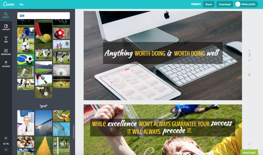
When it comes to creating my actual slides, however, I’ve been defaulting to the Canva web and mobile app. One of the things I love about it is the built-in image search. I type in a keyword related to my topic and Canva serves up dozens of potential image options, available for purchase for just one dollar.
My Podcast Movement presentation included 30 slides in all and cost me right at $20 in images (some images I used were either free or were purchased in the past).
After purchasing an image and downloading it from Canva, Canva gives you 24 hours to make changes to it – for things like resizing, text and other overlays, etc. – without having to incur additional costs.
PRO TIP: Once you’re certain you’ll use an image, I recommend you go ahead and purchase it (with the likely portion you’ll want to use properly positioned and framed) and download it to your computer. Then, upload that version – the one you now own – back into Canva before adding your text and other changes. That way, most all future versions of that image you download – should you need to make a few changes – will be free.
If you’re anything like me, graphic design is not your strong suit. This is why I love Canva so much. It helps even a guy like me create image and text combinations that are compelling and memorable; the kind your audiences will want to capture and share during and after your talk.
Make sure too that you’ve checked with the event organizer regarding the aspect ratio of the screen your slides will appear on (16 x 9 or 4 x 3). Then, be sure you create your slides in Canva using the appropriate ratio.
Stand and Deliver
My final step in the process is to open Keynote (or PowerPoint, Prezi, Haiku Deck, or whatever your preferred presentation delivery software) and upload each of the images I’ve created and saved from Canva.
That’s it. I’m now ready to go.
Using my iPad and iPhone together (two items I carry with me most everywhere) means I’m always ready to go.
PRO TIP: I set Keynote inside my iPhone to show the next slide in my presentation. That way, I always know where I’m going with my talk. This helps me to stay on track and it’s made my time spent practicing much more effective.
Why Not Just Use Keynote for Everything?
You might be asking why I don’t just create everything inside Keynote. Two reasons:
1) Keynote has no image search built in. Though I sometimes use other image options in addition to Canva (Unsplash is one of my favorites), I love having the ability to search for images from within the app I’m using to create my slides (in addition to Canva, Haiku Deck and Prezi also offer this option).
2) I find that I can more easily create awesome-looking image and text combinations in Canva than in most any other app or software I’ve tried. Canva just makes it so easy.
One More Thing…
Enough other experts have written on this last issue that it may go without saying. However, I still see far too many presentations guilty of it. What is it?
Filling your slides with bullet points or full paragraphs of text!
Abstract images – with just a bit of text – will serve you far better in helping to communicate your ideas than will slides filled with text or bullet points and often no image at all.
I find that an app like Canva reminds me of how important the image is to the process. It helps me to concentrate on images first and text second, which is exactly how it should be.
I hope you found this post helpful to you as you work to hone your presentation creation skills.
What are some of your biggest challenges when it comes to creating compelling presentations? Leave your thoughts in the comments below.
Previous RTL Episodes on Public Speaking
Ken Davis – Episode #017
Carmine Gallo – Episode #034
Ryan Avery – Episode #035
Dan Roam – Episode #041
Dr. Gary Ginard – Episode #053
Click to Tweet
To quickly and easily share about this episode on Twitter, just click the link below. Your tweet will automatically be populated with this message:


